Friday, December 18, 2009

The Dr. Ferretstein project

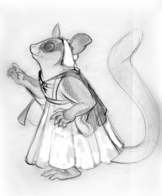
Some of you may have already heard that I have been working on a steam punk project of late. It has been going well, and I am ready to share some rough sketches with you. But first I would like to describe the project a little, so here goes.

The folks at The Gamers Realm have kindly asked me to help them with their project they call "Dr. Ferretstein". This involves bringing to life 10 characters in sketch form (3 views of each character), and 3 polished color images. They intend to brand their retail game store with these characters, and I believe use them as inspiration and illustration in stories later on.

So what's the gist of this story line? Basically, it involves animals who speak, wear clothes, and carry themselves as though they are human. Together with their human friends they have adventures and invent all manner of exciting things in a steam punk world.

What's steam punk you ask? Perhaps this will help:
http://en.wikipedia.org/wiki/Steampunk

I have had a lot of fun with these sketches so far, and only 5 of the characters have been completed. Please enjoy, and check back later to see the final images I have created for these sketches and later developments in the project.


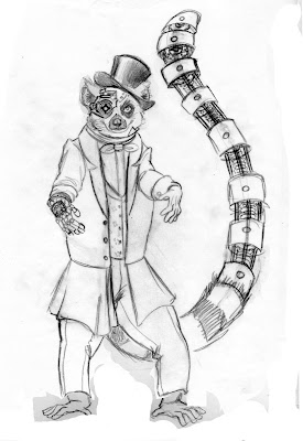
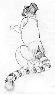
This is Dr. Thomas Honeysweet, a lemur who is Ferretstein's old college buddy and current rival/nemesis:



This is Sir "Robin" Snuffington, a polar bear who is Dr. Ferretstein's lab assistant:


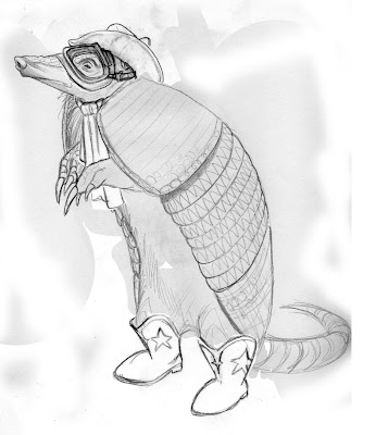
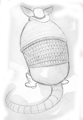
This is Buck Lattimer, an armadillo who is the pilot of Ferretsteins combat dirigible (and a proud Texan):



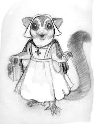
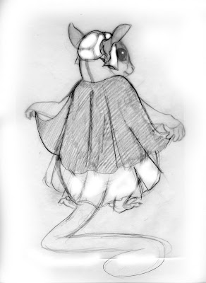
This is Miss Helene Fischer, a sugar glider who is a nurse:


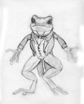
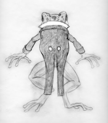
This is Farnsworth, a butler who is a blue poison dart frog:


Tuesday, December 8, 2009

The Prisoner - decoded

In a previous post I suggested a deeper meaning within my painting "The Prisoner ".
I have heard several ideas about what is going on here, some are right some aren't . While I can't know for sure how you will interpret this or any image, I hope that in reading this and reviewing the painting for yourself you may be inspired to look deeper in to works of art ... to tell yourself the story.

What can be seen? Well what can't be seen is another person in the room. He is alone. The work is called "The Prisoner", is this room his prison? Is he reflecting on actually being imprisoned in the past? Is the prison in his mind? Is he a prisoner to an addiction?

We see the man and how he is dressed. He looks like any old fellow we have seen dozens of times down at the local pub. Very clearly he is wearing clothes that are typically American, so he must be American, and he looks to be the right age to have served in either WWII or Korea. A paper at his elbow reads a headline about American Veterans, and this is another clue. Likely it is why he is so pensive. What is he remembering? We can only guess. He stares down into his empty glass that once held what was "hotter than a desert brush fire, colder than a limpet shout", while the liquor bottle points up to another clue about his identity or perhaps what is on his mind. It's the clock with the "Prisoner Of War - Missing In Action" emblem on it. The clock itself sends a dark message about the passage of time, but how deep the meaning may be entirely dependent upon what your relationship is to time and personal loss.

We also see the white walls, and wooden beams behind him. If you look at the texture on the walls, the half circles may begin to look more like wings and the texture like feathers. Notice that there is a white space between them leads up and out of the painting. This is his escape. Is the escape death? I don't know, perhaps. Maybe its not death but symbolic of something abstract that can't be painted in such a realistic scene. Well, hey, at least there is an escape. Right?

I had mentioned earlier that he looks like an average old fella, just down at the local pub for a drink. The lonely figure like so many we have seen, whether its at a pub or a public park. If there is a big "so what" to this painting it is this: that perhaps we should talk to that guy sometime. Hear his story.

Casual conversation may make the all difference for what that "escape" turns out to be.

Thursday, September 24, 2009

Fission of Form

Today I wanted to talk about the exhibit I have a piece in called: Fission of Form. It is still showing at Panza Gallery until October 31st.
Here are some dates to remember:

September 5th thru October 31st, 2009

Poetry Reading October 3rd 6-9pm

Alex Patho opening pics: http://www.pathophoto.com/fof/

Kurt Shaw Review: http://www.pittsburghlive.com/x/pittsburghtrib/ae/museums/s_644709.html

Copy and paste this to see more about the show: http://web.mac.com/panzagallery/Panza_Gallery/FOF.html


So what is it? Kurt Shaw say's it best so I suggest reading his review linked above. But he says in it, "The exhibit started with works created by the Pittsburgh Society of Sculptors, then, members of the Pittsburgh Poets wrote a poem inspired by a particular sculpture. The Pittsburgh Society of Illustrators members randomly chose a poem, and created an illustration without seeing the original sculpture. The sculptures, poems and illustrations are displayed as installed triads."

It's a pretty cool exhibit. I love the poem and the sculpture that are grouped with my painting. I met the sculptor and she seems like a very nice girl. Good sense of humor. I haven't met the poet yet. I will share a JPG here of my image, but if you are in the area you totally should come and check out the show. The Opening night was a lot of fun and I imagine that the Poetry Reading will be too.

Here it is, my image "The Prisoner"


And here is the poem that inspired it:
(you may have to open this attachment in a new window in order to read it)

You may be asking yourself "So why is he a cowboy?". Well, he's not. He is wearing the hat because that style is very American and that helps identify him.

Allow me to explain a philosophy very dear to my heart. I believe that images are to be read, and there are a lot of things to read in this painting. Everything has a meaning to it.
What does the clock say? Is there something I am trying to say with the spacial arrangement and design of the background? Are there any other clues I have left you that tell you what he is thinking about or who he is?

I would like to hear from you.
What do YOU think I am saying in this image? Why?

Tuesday, September 22, 2009

Order of Nine - the color studies


There are various stages that professional illustrators commonly use to create the right kind of image. These are the ones I use:

1. research and gather reference images
2. thumbnail sketches
3. shoot model(s) for photo reference. (takes the guess work out of form and lighting)
4. final sketch
5. color studies
6. final painting

After it is all done I have the piece professionally photographed and the file color corrected. This way I can be certain that my clients have the best possible digital file, and it's all ready to use.

Sometimes I do little sketch exercises to get me thinking before I begin the thumbnail stage, sometimes not. And, word to new illustrators: ALWAYS get your contracts and business arrangements out of the way before you begin any work.

So here I am, at the color study stage for my cover of the newest Order of Nine album. These are my ideas for the color scheme. When I do color studies I like to take the easy way out and I print out my sketch onto regular paper several times, then I paint over top with gouache paint.

I hope that they like them, and you do too. Do you have a favorite? Let me know.
I will let you know what they say.

Sunday, September 20, 2009

ArtOrder challenge


There is a blog site that I like to follow called Art Order. Every now and then they have art challenges listed, and I hope to participate more in the future. Without further ado, I will share this weeks samples with you so you can follow what I am up to.

This is the site if you want to read up on what these silhouettes are all about:

http://artorder.blogspot.com/2009/09/new-challenge.html

Friday, September 11, 2009

the revised sketch


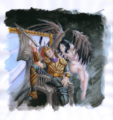
Here is the Order of Nine sketch they picked, and already revised. They only asked for a "hotter angel of death", more definition in the mirror, and to replace the dagger with a shard of broken mirror that is cutting his hand.

I hope they like it.

Wednesday, September 9, 2009

Where to begin?

I would like to imagine posting a sketch every day.

I am imagining it right now, and its lovely! but not always feasible. However I shall endeavor to do my best, and with that I would like to pass along some of the wisdom I have gained through over 10 years of experience as an illustrator. Over the years I have worked on many and various kinds of sci-fi fantasy books, character design, children's books, magazines, RPG's, CCG's, paperbacks, board games, and materials that aid psychologists. I have also many years of experience as a graphic designer and a Manager of Design, so there are a lot of things I might be able to have amusing discussions about. It's really hard getting started, and I wish I had known someone with experience early on for sure.

ok. Enough of that. I have a lot of work before me to do on an album cover, and I wanted to post what I have done for them so far, and document the progress.

the band: Order Of Nine
genre: Metal (fantasy)
album title: 7th Year of a Broken Mirror
The concept I was given: a bad stretch of luck and its nearly over, but its almost too much to take. You may change your luck if you change the man in the mirror. Undertones of suicide.

Not exactly an easy listening album, and the description could lead to so many possible images. I know that they have a dislike of cheesey, over simplified artwork so I thought I would be wise to elude to a deeper story. I don't have the luxury of speaking to them in person, thus I thought I would provide them with at least 5 different and well drawn images.

Here is what I came up with:

1. what says bad luck better than being pursued by an angry mob?


2. Eh, its metal right?


3. being seduced by the angel of death, that's metal.


4.a slightly more fantasy metal way to be seduced by the angel of death.


5. because not everyone thinks the angel of death would be hot...


The sketches went over well. They liked #4, they say the guy in it fits well with a previous cover they had done. But there are some modifications they wanted done to it. And that is what I am supposed to be doing right now instead of blogging.

stay tuned to see the next incarnation of sketch #4.